Microsoft's Fluent 2 design system is a cohesive design language to aid in the user experience of their Dynamics 365 and Microsoft 365 applications. So why don't Professional Services companies take advantage of this system when implementing for customers?
Why Implementers Don't Use the Fluent 2 Design System?
Developers and organizations may not take advantage of the Fluent 2 design system when implementing for their customers for the following reasons:
Lack of awareness. Microsoft needs to market the design system more!
Focus on functionality over design. Microsoft Developers often don't think about the design aesthetic. Just look at the advantage Apple has in this arena!
Pre-Sales did not budget for a UI/UX Designer. If Sales and/or customers want to cut costs, the design aesthetic and user experience is always a place they look to cut. Someone forgot to tell them that user buy-in on deployment will take a hit because of this.
Perception of complexity. Developers often think it is too difficult to learn a design system.
How May We Incorporate Some Fluent 2 Design Rules?
Websites are often comprised of three colors. Designers often have a primary brand color, a secondary color, and then some neutral colors. Not all Designers approach a site this way, but many do.
A general rule-of-thumb that many Designers incorporate is that 60% of a page or form is made up of the neutral colors, 30% is the primary brand color, and 10% is the secondary brand color.
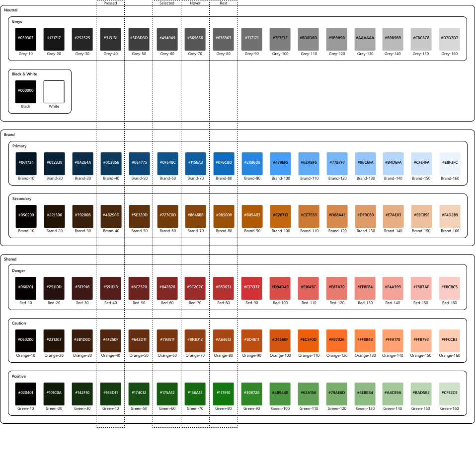
In the Fluent 2 Design System, Microsoft groups the colors into three sections: Neutrals, Brand, and Shared. Neutrals is as you might expect, your blacks, whites, and greys. Brand is your brand's primary and secondary colors. And shared is for colors that come from things like important danger messages in red, cautionary messages in orange, and positive messages in green.
Next, we need to account for button and link states.
Using a Color Map (i.e., Scale) for States
Finally, each of the neutrals, brand, and shared colors are put on a gradient scale. We call this the color map. The scale goes from a dark contrast of the color to a bright version of the color. In the Fluent 2 Design System, scales often are made up of 16 stops.
We then use different versions of the color we choose to account for the resting state of a button and also for hover, selected, and pressed. On a scale of 16, we often use 8 for the resting state, stop 7 is for hover, stop 4 for pressed, and stop 6 for selected.
Here's a Graphic to Help Think it Through
Happy Software Engineering.